|
|
Post by astock5000 on Jan 22, 2018 23:40:34 GMT
Oh dear...
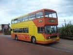
As I've said before I'm not a fan of route branding in London but even so, I agree that this design is very poor and makes the Barkingside version seem good by comparison. Aside from the frequency errors, those stickers on the upper deck front windows are very large, likely blocking the view, and yet the only clearly readable information is the route number - either useless as the blind will also be visible, or potentially misleading if the bus is on the wrong route. The colours seem to clash with the red livery even more with this scheme, and the 90's pink colour makes it look as if the side of the bus has faded badly (that was the impression I got when I first glanced at the photo of VW1176).
With only 25% of buses being done, it will mean less of a reduction in flexibility of allocations compared to Barkingside, however the branding then simply becomes a way of promoting a route rather than also an attempt to reduce confusion and reassure passengers that this is the bus for them (as can be done well by a handful of well managed provincial operators with relatively simple networks compared to London). And once again as I've said before, I believe there are other ways to promote not only individual routes but the network as a whole, without having to restrict operational flexibility and potentially damage the overall "brand" - this latest attempt just does not look professional at all in my opinion, let alone something that sits well with what the London Buses image should be.
|
|
|
|
Post by JaysBusPhotos on Jan 23, 2018 0:26:48 GMT
And I thought you couldn’t make a frog look any worse. Who in there right mind thought that look good, I prefer the old design over this. All TFL need to do is ask operators that have experience with it for advice or let companies do there own for there buses. I pray this doesn’t get rolled out across London. God help the X26 if it dose gets its branding. |
|
|
|
Post by snoggle on Jan 23, 2018 1:11:26 GMT
Well I’ve just seen 8894 on the 490 with 350 branding, boasting the fact it operates on a 12 minute frequency! Dear o dear! flic.kr/p/E3ArHXGood grief - someone should be shot over the frequency error. More proof of my never ending ranting about lack of knowledge, lack of proof reading, lack of management. All that BLEEP from Mike Brown and Val Shawcross about flatter organisations and giving young people more resposibility! Yes that's fine *providing* someone is managing them and there is proper quality assurance. Without them you get this sort of execrable nonsense. As for the rest of the branding effort -  Just get rid of it. Dreadful. Have we been transported to the worst branded bus operation in the UK overnight? This really is a low for London's transport system. I'm going to have to go for a ride on a train and find somewhere that has nice buses that are properly presented as some sort of antidote. Heck I might even have to jump on a plane and go somewhere with exciting buses and metros not this depressing nonsense afflicting London. |
|
Deleted
Deleted Member
Posts: 0
|
Post by Deleted on Jan 23, 2018 7:02:43 GMT
It's amazing really that these route branding efforts are actually worse than the others we've had over the last 30 years. London United's efforts were superior to this, as were the very simple efforts made on route bound RMs. I was going to say it can't be that difficult, but it clearly is on the evidence so far, and that is how Ray Stenning can justify his money. The world has moved on a lot since those past efforts. There is quite a crowded field when it comes to well promoted, branded vehicles / routes and TfL's "efforts" are at the bottom of the pile. There is nothing original about any of it - it's all been nicked from around the country. Did they employ a magpie to go and steal bits of branding or did someone at Palestra sit and page through Flickr for a few days? Sometimes simple works well as with the basic but clearly thought out branding on the Routemasters. They were either properly route bound or, as with Centrewest, the via points were cleverly chosen to allow use on either the 7 or 23 without causing confusion. London United had the benefit of a nice, basic livery to start with and those in charge post privatisation at least understood the heritage of the company and also its operating area. If you know that then you're in a good place to pick some appropriate promotional routes. When real world professionals like Roger French and Ray Stenning (who clearly has a vested interest) denounce your efforts and question why you bothered then it really is time to stop and do things properly or not at all. London Transport used to be an exemplar in original design and well considered consistency. Now its successor is reduced to cobbling together a pile of old rubbish borrowed from others. If this is an indicator of how much effort they are putting into the bus “piece” within TfL then i worry for the future. It is clearly a very low priority , even though bus travel is the most used form of public t4ansport in London. Yet again pathetic nonsense from TfL. |
|
Deleted
Deleted Member
Posts: 0
|
Post by Deleted on Jan 23, 2018 7:11:24 GMT
|
|
|
|
Post by Green Kitten on Jan 23, 2018 7:22:04 GMT
I don’t know... still seems a bit bland... |
|
|
|
Post by sid on Jan 23, 2018 8:08:11 GMT
Well I’ve just seen 8894 on the 490 with 350 branding, boasting the fact it operates on a 12 minute frequency! Dear o dear! flic.kr/p/E3ArHXGood grief - someone should be shot over the frequency error. More proof of my never ending ranting about lack of knowledge, lack of proof reading, lack of management. All that BLEEP from Mike Brown and Val Shawcross about flatter organisations and giving young people more resposibility! Yes that's fine *providing* someone is managing them and there is proper quality assurance. Without them you get this sort of execrable nonsense. As for the rest of the branding effort - Just get rid of it. Dreadful. Have we been transported to the worst branded bus operation in the UK overnight? This really is a low for London's transport system. I'm going to have to go for a ride on a train and find somewhere that has nice buses that are properly presented as some sort of antidote. Heck I might even have to jump on a plane and go somewhere with exciting buses and metros not this depressing nonsense afflicting London.
I agree that heads should roll over the frequency errors........unbelievable!!
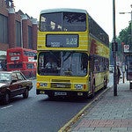
Whilst I'm very much in favour of route branding in principle this really is a half hearted effort. It almost seems that having had instructions from the mayor to implement route branding TfL have thought (rather like when you ask the kids to make a cup of tea  ) "lets make a bad job of it and then he won't ask us to do it again......................we'll advertise the wrong frequencies................we'll make no effort to keep buses on the correct routes.................and we'll make it look as ugly as possible". The 90 and 350 don't look too bad, but they could certainly be a lot better, but the 140, oh dear ) "lets make a bad job of it and then he won't ask us to do it again......................we'll advertise the wrong frequencies................we'll make no effort to keep buses on the correct routes.................and we'll make it look as ugly as possible". The 90 and 350 don't look too bad, but they could certainly be a lot better, but the 140, oh dear  . And it's being withdrawn from Heathrow if the Crossrail proposal goes ahead. I suppose the green sticker in the top deck window (although front upper deck window views are poor enough as it is on 'frog faces' ) does make it easier to identify from a distance but why put a green '140 sticker' on the rear next to the route number? . And it's being withdrawn from Heathrow if the Crossrail proposal goes ahead. I suppose the green sticker in the top deck window (although front upper deck window views are poor enough as it is on 'frog faces' ) does make it easier to identify from a distance but why put a green '140 sticker' on the rear next to the route number?
If a jobs worth doing it's wort doing well, get Ray Stenning or whoever in to do the job properly! |
|
|
|
Post by RandomBusesGirl on Jan 23, 2018 10:36:50 GMT
I tweeted them fools over the route 350 error but of course conveniently no response  Well they won't get rid of me as I'll be sending a formal complaint anyway. Pathetic, I think secondary school kids could have organized this better. |
|
|
|
Post by JaysBusPhotos on Jan 23, 2018 11:55:20 GMT
I don’t know... still seems a bit bland... Bland but alot better than what we've been given. |
|
|
|
Post by sid on Jan 23, 2018 12:47:18 GMT
I tweeted them fools over the route 350 error but of course conveniently no response Well they won't get rid of me as I'll be sending a formal complaint anyway. Pathetic, I think secondary school kids could have organized this better. Absolutely, somebody needs to be held accountable for such gross incompetence! |
|
|
|
Post by BusesInLondon on Jan 23, 2018 13:00:38 GMT
With only 25% of buses being done, it will mean less of a reduction in flexibility of allocations compared to Barkingside, however the branding then simply becomes a way of promoting a route rather than also an attempt to reduce confusion and reassure passengers that this is the bus for them (as can be done well by a handful of well managed provincial operators with relatively simple networks compared to London). And once again as I've said before, I believe there are other ways to promote not only individual routes but the network as a whole, without having to restrict operational flexibility and potentially damage the overall "brand" - this latest attempt just does not look professional at all in my opinion, let alone something that sits well with what the London Buses image should be. Yet, whilst commuting, I saw VWH2237 was on the 182 this morning; was quite suprised to see it fly past on the "wrong route"! Also, does anyone know if there are stickers on the inside like the Barkingside examples? |
|
|
|
Post by snoggle on Jan 23, 2018 13:07:42 GMT
I agree that heads should roll over the frequency errors........unbelievable!!
Whilst I'm very much in favour of route branding in principle this really is a half hearted effort. It almost seems that having had instructions from the mayor to implement route branding TfL have thought (rather like when you ask the kids to make a cup of tea ) "lets make a bad job of it and then he won't ask us to do it again......................we'll advertise the wrong frequencies................we'll make no effort to keep buses on the correct routes.................and we'll make it look as ugly as possible". The 90 and 350 don't look too bad, but they could certainly be a lot better, but the 140, oh dear . And it's being withdrawn from Heathrow if the Crossrail proposal goes ahead. I suppose the green sticker in the top deck window (although front upper deck window views are poor enough as it is on 'frog faces' ) does make it easier to identify from a distance but why put a green '140 sticker' on the rear next to the route number?
If a jobs worth doing it's wort doing well, get Ray Stenning or whoever in to do the job properly! I'm not convinced that branding came from the Mayor. There was the rather pathetic "Bus Action Plan" which was a TfL creation to presumably take some heat off the Mayor's lack of obvious policies for buses. It was a classic "we must do something" type of initiative. The Mayor put his name to the plan but he sort of has to do that as Chair of TfL. The big change is that patronage has not recovered so the plan is now completely out of date and irrelevant given the massive mileage cuts being planned. No one has said that of course but the reality is that life has moved on. My sense of things is that TfL did this "in house" to save money (Leon Daniels said as much) but also as a "we can do it as well but cheaper" than those fancy designers who cost a fortune. I also think someone decided that Hayes had to be different in approach to Barkingside to provide a differentiation so that if there are different levels of increased patronage between the two trial areas that some of the difference can be identified with the different branding styles. I think we are all agreed that errors related to frequencies on the branding are unacceptable. Does anyone know if the bus stop flags been colour coded for the Hayes trial? Also have the spider maps been changed in style? If they haven't then that's another difference between the trial areas. |
|
Deleted
Deleted Member
Posts: 0
|
Post by Deleted on Jan 23, 2018 13:20:30 GMT
Leon Daniels stated last year that the branding was at the request of the Mayor.
|
|
|
|
Post by snoggle on Jan 23, 2018 14:53:52 GMT
Leon Daniels stated last year that the branding was at the request of the Mayor. Mr Daniels will have been towing the party line as he did throughout his time at TfL. As I said before I don't believe that the detail of the bus action plan emanated from City Hall. The idea to have a plan might well have done so as someone in his team will have spotted there was a gaping hole in his manifesto to deal with what was a small fall in bus usage when he became Mayor. TfL will have done the detailed work on what is a transport issue, not a political concept. I don't see how the Mayor would even think about bus branding. He's a lawyer by training and experience - like many MPs. |
|
|
|
Post by busoccultation on Jan 23, 2018 14:54:21 GMT
Also, does anyone know if there are stickers on the inside like the Barkingside examples? They do have route diagrams that displays every stops on the route inside the bus which is similar to those are inside of a Underground train. They can be found on either the middle or rear of the bus on the lower deck and upper deck of 128, 150 and 247 branded buses as well. The reason they not found on the upper deck of 169 and 275 buses is that the emergency hammers and CCTV cameras are in the way and there are not enough space to fit them, but on those routes they can still be found on the lower deck. |
|


 ) "lets make a bad job of it and then he won't ask us to do it again......................we'll advertise the wrong frequencies................we'll make no effort to keep buses on the correct routes.................and we'll make it look as ugly as possible". The 90 and 350 don't look too bad, but they could certainly be a lot better, but the 140, oh dear
  . And it's being withdrawn from Heathrow if the Crossrail proposal goes ahead. I suppose the green sticker in the top deck window (although front upper deck window views are poor enough as it is on 'frog faces'


