|
|
Post by vjaska on Mar 20, 2017 17:00:51 GMT
Unlike many on here, I still think route branding could work in London but I'm afraid it has to be more imaginative than the concepts proposed - 100% red is already dull enough but shoving some boring white font on top doesn't improve it much - people aren't going to be attracted by something basic like that.
The R route changes was a perfect chance to provide such a better network of branding - the Roundabout name or a 'Network Orpington' name plus 11 different colours (one for each route) could of been introduced to gives clear determination of which route is which and the whole case of localised links.
|
|
|
|
Post by vjaska on Mar 20, 2017 17:01:44 GMT
Great, doesn't have the route number on it so what will happen if it goes on another route like the 2, newcomers will think that is where the two goes. It's going to be a b!tch to have to walk round the side of the bus to look at the side blind... if they are really going to move it to the offside  I think they're adding an extra side blind rather than moving the nearside one. |
|
|
|
Post by vjaska on Mar 20, 2017 17:03:18 GMT
Sorry I'm confused! Has the branding actually been applied to VLA18 in real life? Or is it a mock-up of what it *could* look like? It's actually been applied. |
|
Deleted
Deleted Member
Posts: 0
|
Post by Deleted on Mar 20, 2017 17:23:03 GMT
Before we criticise why don't we give TfL time to adapt the branding and livery, in the provinces operators have had years to perfect branding whereas now it's back to square one for TfL. Some will remember the really horrid efforts made by NXWM years ago but now look at the brand.
|
|
|
|
Post by astock5000 on Mar 20, 2017 17:34:48 GMT
It shouldn't be square one though, back when the rather poor attempts were being made in the provinces route branding simply hadn't evolved into what it is today. There are plenty of good examples used by provincial operators now that TfL could take inspiration from if they have to use route branding.
However these concepts are not good examples and also are not in the spirit of London Transport either, which might be why they seem to clash with the livery to me.
I'm not a fan of route branding in London, I guess I could live with it if it was done well though doing a great job with the branding seems tricky due to the livery. Even so I just don't see how this is the best that TfL could have come up with.
|
|
|
|
Post by snoggle on Mar 20, 2017 17:40:32 GMT
Before we criticise why don't we give TfL time to adapt the branding and livery, in the provinces operators have had years to perfect branding whereas now it's back to square one for TfL. Some will remember the really horrid efforts made by NXWM years ago but now look at the brand. Being frank why should we? People are expressing their opinions on what has been made available. If, by some amazing fluke, the branding exercise proves spectacularly successful I'll happily say I was wrong. On your wider point about the industry outside London one wonders if TfL have actually sought advice - there are plenty of professionals in the industry who run services in London and outside who would be prepared to at least share their experience privately. Furthermore there is paid expertise in a few marketing and branding consultancies that TfL could access subject to appropriate payment. People like Ray Stenning have made a number of their views about branding public anyway so that's out in the open and I'd hope people in TfL would have read what he's written. It's clear from people spending only seconds looking at the design sketches that there are rudimentary and basic errors that ignore interchange and demand drivers in reality. If they can't get that right even on a sketch then what hope for the reality? And I go back to my core point in all of this - a few stickers on the side of buses does not change the fundamentals of service delivery, quality and passenger experience. When we go back to the early to mid 2000s when bus use was booming it was because there were good quality services, travel times had fallen demonstrably in a lot of places, new low floor buses were coming on stream and the worst aspects of overcrowding were being dealt with through expansion. There was no branding campaign because people could see the service was better. The current situation is almost the exact opposite of that. It's very hard to market products, that are getting worse, to the paying public. |
|
|
|
Post by ServerKing on Mar 20, 2017 19:46:50 GMT
I had a feeling TfL had lost the plot over buses, but this confirms it. STOP this utter nonsense while it is in paper form. As much as route branding seems quite good lets not delude ourselves. Why is money going to be spent to tell people information that is probably 95% known. People who dont take buses, generally know that there will probably be a bus or buses that takes them from A to B. Its London. What happens is that the person sees a bus regularly outside their Home or point 'A', i.e. 275 Highams Park and then sees that said bus again at their destination B, say Woodford, and then thinks, wow I did not know it went there, I will take the 275, there instead of the car. Route branding would be a very inefficient way to reach about maybe 10 people in every 100,000. Where does anyone who needs a bus go?, a bus stop, and so information at the bus stop is more important and sufficient. Queue TfL's next big plan, ' we need GIANT FOAM FINGERS' to point people to bus stops.What about the revenue loss from advertising space lost??? TfL needs to the income. There are bigger issues at hand with buses. Who is running TfL?? TfL might again recruit Customer Assistants wearing said hands to point them in the general direction of the branded buses. Thankfully, sellers on ebay seeing a corner of the market  have cottoned on very quickly  |
|
|
|
Post by jay38a on Mar 20, 2017 19:50:01 GMT
Unlike many on here, I still think route branding could work in London but I'm afraid it has to be more imaginative than the concepts proposed - 100% red is already dull enough but shoving some boring white font on top doesn't improve it much - people aren't going to be attracted by something basic like that. The R route changes was a perfect chance to provide such a better network of branding - the Roundabout name or a 'Network Orpington' name plus 11 different colours (one for each route) could of been introduced to gives clear determination of which route is which and the whole case of localised links. I would love to see "Roundabout" name back. Ok it would be very simple but say on the back of buses have genetic information on route info and frequencies. |
|
|
|
Post by sid on Mar 20, 2017 20:01:32 GMT
I had a feeling TfL had lost the plot over buses, but this confirms it. STOP this utter nonsense while it is in paper form. As much as route branding seems quite good lets not delude ourselves. Why is money going to be spent to tell people information that is probably 95% known. People who dont take buses, generally know that there will probably be a bus or buses that takes them from A to B. Its London. What happens is that the person sees a bus regularly outside their Home or point 'A', i.e. 275 Highams Park and then sees that said bus again at their destination B, say Woodford, and then thinks, wow I did not know it went there, I will take the 275, there instead of the car. Route branding would be a very inefficient way to reach about maybe 10 people in every 100,000. Where does anyone who needs a bus go?, a bus stop, and so information at the bus stop is more important and sufficient. Queue TfL's next big plan, ' we need GIANT FOAM FINGERS' to point people to bus stops. What about the revenue loss from advertising space lost??? TfL needs to the income. There are bigger issues at hand with buses. Who is running TfL?? There are always bigger issues at hand so that's a red herring. How does this confirm that TfL have lost the plot? Route branding is comparatively inexpensive to apply so if you're worried about the cost to use your own analogy there are far bigger issues. |
|
|
|
Post by sid on Mar 20, 2017 20:05:52 GMT
Before we criticise why don't we give TfL time to adapt the branding and livery, in the provinces operators have had years to perfect branding whereas now it's back to square one for TfL. Some will remember the really horrid efforts made by NXWM years ago but now look at the brand. Well exactly, I mean route branding isn't going to make anybody not travel by bus so I'm not sure what all the negativity is about? Obviously opinions are going to vary on styles of branding so that'll be nothing new. I think it's good that TfL are using a bit of imagination, to most people plain red buses are all the same. |
|
Deleted
Deleted Member
Posts: 0
|
Post by Deleted on Mar 20, 2017 20:22:03 GMT
I'm sure those pics are real but they look very grainy and blurry  I don't like the large number for the every 6 mins it almosts looks like a route number on the rear. |
|
|
|
Post by sid on Mar 20, 2017 20:27:07 GMT
Unlike many on here, I still think route branding could work in London but I'm afraid it has to be more imaginative than the concepts proposed - 100% red is already dull enough but shoving some boring white font on top doesn't improve it much - people aren't going to be attracted by something basic like that. The R route changes was a perfect chance to provide such a better network of branding - the Roundabout name or a 'Network Orpington' name plus 11 different colours (one for each route) could of been introduced to gives clear determination of which route is which and the whole case of localised links. Colour coding is particularly useful and helps partially sighted people, and everybody else of course, identify buses and the Orpington network would be ideal. |
|
|
|
Post by snoggle on Mar 20, 2017 22:41:29 GMT
Unlike many on here, I still think route branding could work in London but I'm afraid it has to be more imaginative than the concepts proposed - 100% red is already dull enough but shoving some boring white font on top doesn't improve it much - people aren't going to be attracted by something basic like that. The R route changes was a perfect chance to provide such a better network of branding - the Roundabout name or a 'Network Orpington' name plus 11 different colours (one for each route) could of been introduced to gives clear determination of which route is which and the whole case of localised links. Colour coding is particularly useful and helps partially sighted people, and everybody else of course, identify buses and the Orpington network would be ideal. And is not particularly useful to those of us who are colour blind and may find it difficult to distinguish between certain colours. Maps that use excessive amounts of colour can be really awful and confusing. It is surprising how few people who design these things have any clue what they may be inflicting on a proportion of the population. |
|
|
|
Post by twobellstogo on Mar 20, 2017 23:22:48 GMT
Colour coding is particularly useful and helps partially sighted people, and everybody else of course, identify buses and the Orpington network would be ideal. And is not particularly useful to those of us who are colour blind and may find it difficult to distinguish between certain colours. Maps that use excessive amounts of colour can be really awful and confusing. It is surprising how few people who design these things have any clue what they may be inflicting on a proportion of the population. I agree that some maps with loads of colour can be very confusing - and my colour sight is fine. A splash of colour though is attractive. Back on topic - I'm afraid all five of these concepts are either dull, confusing or both. I hope to see some considerable refinement before these are inflicted on us, and in the general way I like a bit of decent route branding. |
|
|
|
Post by danorak on Mar 21, 2017 0:07:23 GMT
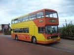
Route branding can work but these are poor efforts. Compare the 90s branding on the 19 with what's illustrated there. Pick up the phone to Mr Stenning and do it properly or don't bother.
|
|


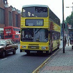


 I don't like the large number for the every 6 mins it almosts looks like a route number on the rear.