|
|
Post by abellion on Feb 25, 2024 12:44:18 GMT
An odd curiosity here: Despite the addition of SL3, Chislehurst Station retained the old format. See here.
Now compare this with Abbey Wood which has the new format. See here.
I'd ask which y'all find more useful but the answer seems pretty obvious. Abbey Wood has the misfortune of not actually showing any other SL3 stops southbound barring Bexleyheath and then you're left with an indication that it goes all the way to Bromley North with no indication of through where. Particularly unfortunate for an express bus service where passengers are perhaps more likely than other routes to travel a bit further. On the other hand, the Chislehurst Station one does do all that and what a difference it makes.
Bexleyheath may actually be the worst out of them lot. No stops at all due to the distance. Just the termini at the arrow. Too bad if you wanted to know if you could make the relatively quick hop to the next stop! I’m pretty sure there’s also a map somewhere which has the SL1 and ‘24 hours weekend’ on the 34 despite the latter being gone for almost 4 years. |
|
|
|
Post by lonmark on Feb 25, 2024 15:18:45 GMT
I would rather stick with The Greater London Bus map online or print it out.
Mike Harris did a good job!
It's a shame that TfL can't provide the four parts of Greater London bus maps anymore.
|
|
Deleted
Deleted Member
Posts: 0
|
Post by Deleted on Feb 25, 2024 16:34:59 GMT
I would rather stick with The Greater London Bus map online or print it out. Mike Harris did a good job! It's a shame that TfL can't provide the four parts of Greater London bus maps anymore. Yes I used to find the Quadrant maps so useful when planning journeys in parts of London I was not as familiar with as my own Quadrant. |
|
|
|
Post by Unorm on Feb 25, 2024 23:59:40 GMT
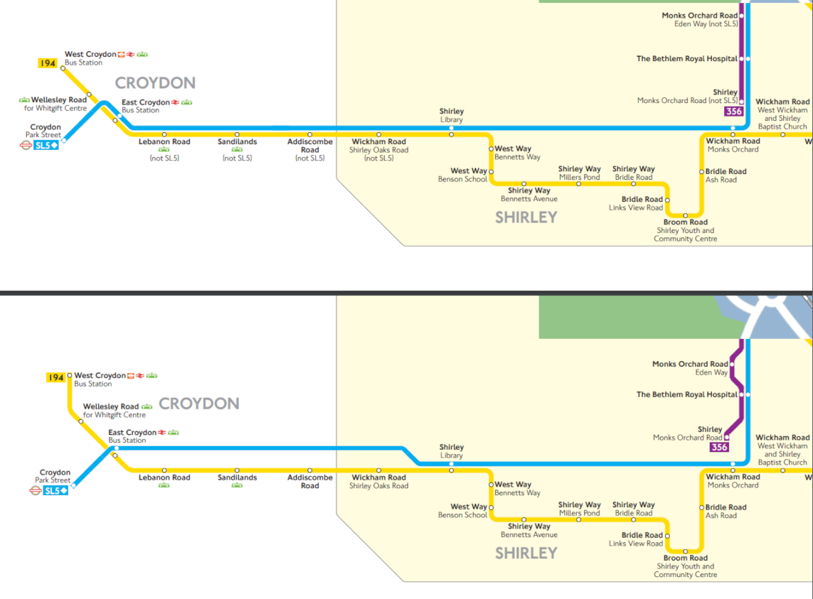
I too have gripes with the newer style map, about 60% for it's lack of usability but 40% artistically, if I'm being generous with my estimations. Definitely the first time I'm bringing it up on this forum, though my pastime in my teens was editing up maps for fun. Slightly ashamed to link of older ones, but it's out there. I haven't lately looked at maps ever since SL6 but now I have of SL3, I've also looked at some of SL5's I felt something, a nerve. Let's play Spot the Difference!   Answer: How many "not SL5" have you seen in the bottom image? This Eden Park map, as you can see, has lots of space to work with. There doesn't have to be copy-paste "not SL5" drowning your perception as you figure out if SL5 stops at Sandilands or not, it doesn't. You're paying attention to if there is that little white blob or not. It's the type of little things that add up problem, or however it's phrased. Perhaps it's meant to convey SL5 shares the same roads as 194, which can be done precisely as I've done but with less space in between. For my artistic complaint the above, which I've seen in Chislehurst regarding SL3 too, looks easily remedied and seemingly I have. Not exactly easy to copy-paste this philosophy with SL8 and 207/427 but at least some maps this can relegate the "not SL3" from constant clutter into only when necessary (i.e non-SL routes also have the rare "not xxx" in some areas) Spot the not H26  Artistic complaint I stress in the same way as a chef would be annoyed at poor cooked food, a map being easy and simple to digest and read - instead of cluttered and/or avoidable duplication. Tasty and cooked instead of part-raw. Probably done too many map edits of my own but concise maps with details I enjoyed, and it is what got me into the space from the era of Yellow Pages with the final pages including bus maps of adjacent town centres (for me Streatham, Brixton and... Tooting Broadway) Going against what I've pledged is my old edit of Bromley North following announcement of Superloop. SL5 sort of worked but SL3 cluttered. If there's one thing I fall short on is me not in the map editing department at TfL  , not that I'd be like so-called Banana King whose company shares dropped, then he left retirement to take over his company and bring it back into shape - I couldn't be a one man army and whip out maps left right and centre. Though there are weird one men army with passion - Harry Beck perhaps? |
|
Deleted
Deleted Member
Posts: 0
|
Post by Deleted on Feb 26, 2024 10:08:58 GMT
I too have gripes with the newer style map, about 60% for it's lack of usability but 40% artistically, if I'm being generous with my estimations. Definitely the first time I'm bringing it up on this forum, though my pastime in my teens was editing up maps for fun. Slightly ashamed to link of older ones, but it's out there. I haven't lately looked at maps ever since SL6 but now I have of SL3, I've also looked at some of SL5's I felt something, a nerve. Let's play Spot the Difference!   Answer: How many "not SL5" have you seen in the bottom image? This Eden Park map, as you can see, has lots of space to work with. There doesn't have to be copy-paste "not SL5" drowning your perception as you figure out if SL5 stops at Sandilands or not, it doesn't. You're paying attention to if there is that little white blob or not. It's the type of little things that add up problem, or however it's phrased. Perhaps it's meant to convey SL5 shares the same roads as 194, which can be done precisely as I've done but with less space in between. For my artistic complaint the above, which I've seen in Chislehurst regarding SL3 too, looks easily remedied and seemingly I have. Not exactly easy to copy-paste this philosophy with SL8 and 207/427 but at least some maps this can relegate the "not SL3" from constant clutter into only when necessary (i.e non-SL routes also have the rare "not xxx" in some areas) Artistic complaint I stress in the same way as a chef would be annoyed at poor cooked food, a map being easy and simple to digest and read - instead of cluttered and/or avoidable duplication. Tasty and cooked instead of part-raw. Probably done too many map edits of my own but concise maps with details I enjoyed, and it is what got me into the space from the era of Yellow Pages with the final pages including bus maps of adjacent town centres (for me Streatham, Brixton and... Tooting Broadway) Going against what I've pledged is my old edit of Bromley North following announcement of Superloop. SL5 sort of worked but SL3 cluttered. If there's one thing I fall short on is me not in the map editing department at TfL  , not that I'd be like so-called Banana King whose company shares dropped, then he left retirement to take over his company and bring it back into shape - I couldn't be a one man army and whip out maps left right and centre. Though there are weird one men army with passion - Harry Beck perhaps? That’s definitely an improvement over the (Not SL5) tags they have adapted. On the older style maps showing the 96 route, they used to use squared dots to show the non stop section between Dartford & Bluewater, which they seemed to dump when it started serving Darent Valley Hospital. They should adapt that for the non stop sections of the new Superloop routes. |
|
|
|
Post by Green Kitten on Feb 26, 2024 11:49:08 GMT
That’s definitely an improvement over the (Not SL5) tags they have adapted. On the older style maps showing the 96 route, they used to use squared dots to show the non stop section between Dartford & Bluewater, which they seemed to dump when it started serving Darent Valley Hospital. They should adapt that for the non stop sections of the new Superloop routes. I agree with the comments on the nonsensical (not SL5) labels. I would also say that the SuperLoop routes could entirely have a different style of line compared to standard routes so they are highlighted more. |
|
Deleted
Deleted Member
Posts: 0
|
Post by Deleted on Feb 26, 2024 12:52:58 GMT
That’s definitely an improvement over the (Not SL5) tags they have adapted. On the older style maps showing the 96 route, they used to use squared dots to show the non stop section between Dartford & Bluewater, which they seemed to dump when it started serving Darent Valley Hospital. They should adapt that for the non stop sections of the new Superloop routes. I agree with the comments on the nonsensical (not SL5) labels. I would also say that the SuperLoop routes could entirely have a different style of line compared to standard routes so they are highlighted more. Yes maybe double lines with a white line in the middle like how non tube lines are designed on the tube map. |
|
|
|
Post by ian on Feb 27, 2024 22:56:13 GMT
I hadn't stumbled across this until recently: www.quickmap.com/london-bus-map.htmThought it was quite an interesting way of presenting things, with pluses and minuses, but the SL routes are pretty clear. |
|
Deleted
Deleted Member
Posts: 0
|
Post by Deleted on Feb 28, 2024 16:51:33 GMT
I hadn't stumbled across this until recently: www.quickmap.com/london-bus-map.htmThought it was quite an interesting way of presenting things, with pluses and minuses, but the SL routes are pretty clear. I’ve never seen this before, I really like that. Very similar to the old Quadrant maps but all in one. The only alterations I’d make would be still showing the places on the outer limits of the London bus network, like Redhill, Slough, Westerham etc. Maybe also including Non TFL buses that cross into Greater London. That would make it perfect. |
|
|
|
Post by redexpress on Feb 28, 2024 21:24:32 GMT
I hadn't stumbled across this until recently: www.quickmap.com/london-bus-map.htmThought it was quite an interesting way of presenting things, with pluses and minuses, but the SL routes are pretty clear. That's interesting. Overall a pretty good map, although it does have its limitations especially in busy areas. For example combining Wood Green and Turnpike Lane into one blob makes it hard to distinguish which routes terminate at which location. Of course squeezing so much information into a map of that size will always involve some compromises.
I dread to think what it would look like if it had been done prior to the thinning out of central London services! Oxford Street would be a mess for a start. There's probably a case for reducing the number of descriptive "blobs" and letting the road names do the talking. Some of the blobs could also use shorter names (e.g. "Stroud Green" instead of "Crouch Hill Stroud Green Road"). This would help declutter the map.
I do like the way terminating routes are shown with directional square brackets - simple and effective. I agree the SL routes are handled pretty well.
|
|
Deleted
Deleted Member
Posts: 0
|
Post by Deleted on Mar 4, 2024 21:37:27 GMT
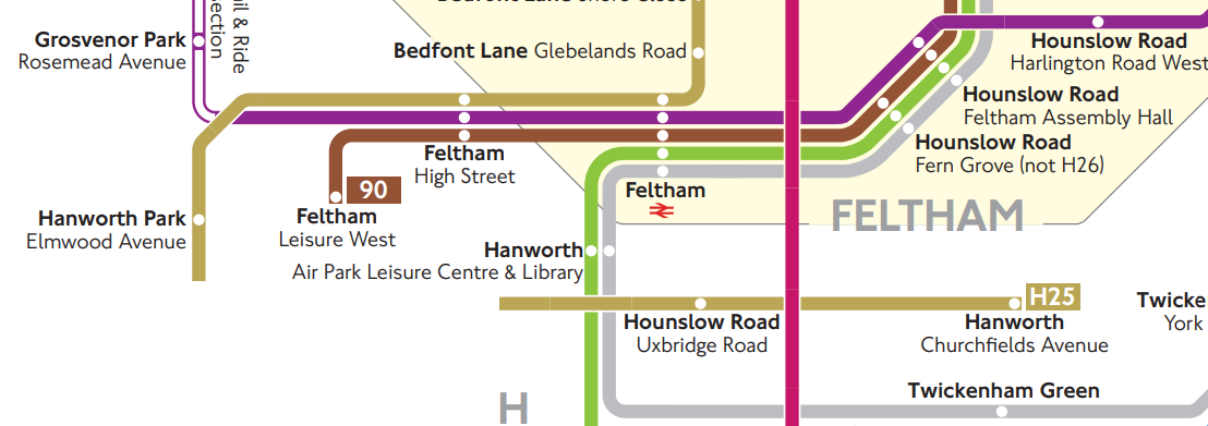
I was just having a random look at some spider maps of distant parts of London from my area to do a bit of route studying like I often do when I’m bored, and noticed something strange. TFL have uploaded an incomplete map for Hatton Cross. Route H25 to be precise around Hanworth, there’s a huge missing gap in the route’s line. Very professional.
|
|
|
|
Post by britishguy54 on Mar 6, 2024 11:09:23 GMT
 This error on the Barking Spider Map bugs me. They could have at least routed the SL2 northwards after Cranbrook Road. |
|
|
|
Post by Eastlondoner62 on Mar 6, 2024 12:41:14 GMT
View AttachmentThis error on the Barking Spider Map bugs me. They could have at least routed the SL2 northwards after Cranbrook Road. Also, doesn't the SL2 stop at Sainsburys? Unlike what the map says |
|
|
|
Post by britishguy54 on Mar 6, 2024 17:07:34 GMT
View AttachmentThis error on the Barking Spider Map bugs me. They could have at least routed the SL2 northwards after Cranbrook Road. Also, doesn't the SL2 stop at Sainsburys? Unlike what the map says That is correct. It does stop at Sainsbury’s. Perhaps these maps were rushed out by TFL. Speaking of which, what’s the chances we see new Spider Maps for Upminster and Harold Wood, with the 497 being axed, and the 346 taking its place? |
|
|
|
Post by ronnie on Mar 6, 2024 17:19:46 GMT
I hadn't stumbled across this until recently: www.quickmap.com/london-bus-map.htmThought it was quite an interesting way of presenting things, with pluses and minuses, but the SL routes are pretty clear. This is great work! |
|