|
|
Post by TNL33036 on Jun 28, 2023 11:49:59 GMT
|
|
|
|
Post by lonmark on Jun 28, 2023 11:55:22 GMT
About time for a change! I like new colour as suit for Brighton&Hove buses. Don't ask London to change the colour. TfL won't do it for future. |
|
|
|
Post by danorak on Jun 28, 2023 11:59:40 GMT
I'm really not sure about this. B&H has a strong brand image, with striking colours that have been identified with Brighton - and its high quality bus service - for many years. The new colours are generic and look more like an Arriva refresh to me. I wonder what Roger French thinks!
|
|
|
|
Post by greenboy on Jun 28, 2023 12:16:02 GMT
I'm really not sure about this. B&H has a strong brand image, with striking colours that have been identified with Brighton - and its high quality bus service - for many years. The new colours are generic and look more like an Arriva refresh to me. I wonder what Roger French thinks! That's what I thought, looks too much like Arriva. I don't see the need to change from the current livery. |
|
|
|
Post by borneobus on Jun 28, 2023 12:21:40 GMT
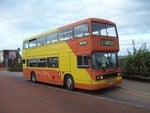
I'm really not sure about this. B&H has a strong brand image, with striking colours that have been identified with Brighton - and its high quality bus service - for many years. The new colours are generic and look more like an Arriva refresh to me. I wonder what Roger French thinks! Three weeks ago I spent a very enjoyable afternoon in Brighton sampling the bus scene. Three observations: 1) B&H have done a great job with route branding 2) The red and cream scheme still looks cool, in fact rather classy 3) I had three rides, all very enjoyable particularly the ride on StreetDeck 838 from Hove Station to Clock Tower on the branded route 7 / very pleasant lady driver, comfortable seats, clean and bright and just a nice ambiance on board Brighton feels like a town, sorry city where buses thrive and still have a key role to play with the local community. |
|
|
|
Post by wirewiper on Jun 28, 2023 12:25:35 GMT
It seems to be a development of the livery that was applied to the 54 ADL Enviro400ER buses that were introduced from 2019. It's miles better than the Stagecoach rebrand! In truth, Brighton & Hove has been moving away from the traditional red and cream for some time. The Coaster buses appeared in a green and blue livery from 2016. Photos (not mine): flic.kr/p/2oFigb5flic.kr/p/2oDD6uhflic.kr/p/2oBGDfXNow, if they could only do something with Plymouth CityBus ..... |
|
|
|
Post by danorak on Jun 28, 2023 12:35:25 GMT
Nothing wrong with special brand liveries but I tend to be with Viscount Falkland on this: "If it is not necessary to change, it is necessary not to change". I'm not sure what the gain is from this particular rebrand other than a nebulous 'time for a change'. If B&H were failing, I could understand it.
|
|
|
|
Post by southlondon413 on Jun 28, 2023 12:42:34 GMT
It seems to be a development of the livery that was applied to the 54 ADL Enviro400ER buses that were introduced from 2019. It's miles better than the Stagecoach rebrand! In truth, Brighton & Hove has been moving away from the traditional red and cream for some time. The Coaster buses appeared in a green and blue livery from 2016. Photos (not mine): flic.kr/p/2oFigb5flic.kr/p/2oDD6uhflic.kr/p/2oBGDfXNow, if they could only do something with Plymouth CityBus ..... The press release on their website makes this 100% clear that it’s a development of that brand. |
|
|
|
Post by vjaska on Jun 28, 2023 14:10:44 GMT
Nothing wrong with special brand liveries but I tend to be with Viscount Falkland on this: "If it is not necessary to change, it is necessary not to change". I'm not sure what the gain is from this particular rebrand other than a nebulous 'time for a change'. If B&H were failing, I could understand it. Completely agree - I've felt the same way regarding a few other livery re-brandings like Stagecoach and even Arriva where I absolutely can't stand the current livery when they had the very nice and sleek interurban livery with the thinner cow horn. Brighton to me is red and cream - surely, if a new livery was warranted, just change how it's applied on the buses rather than the actual colours just like how some football teams change up their design from time to time like Southampton & Bayern Munich keeping their colours but switching from a stripe style to another style. I also don't understand how two tone teal/blue/aquamarine screams inclusivity - is red and cream the opposite or am I missing something? The only re-branding that I felt was needed in recent times is First as they were failing but since then, they started reversing that and the re-brand they went for is personally a massive upgrade over the old bland liveries. |
|
|
|
Post by twobellstogo on Jun 28, 2023 15:58:59 GMT
As it stands, the livery is nice. As a Brighton livery specifically, perhaps I’ll get used to it, but I’m not sure.
It’s certainly better than the new NX West Midlands boring grey, at least!
|
|
|
|
Post by rif153 on Jun 28, 2023 18:28:08 GMT
I'm down in Brighton quite regularly so have had plenty of experience using B&H buses. The new livery looks like they're extending the colour scheme used on MMCs the 1 and 5 have to all other routes. Will be strange to lose the iconic cream and red though I think the font on the current livery looks quite tired. I've never been the greatest fan of the interiors though so hopefully the refresh is an improvement.
|
|
|
|
Post by Busboy105 on Jun 28, 2023 22:20:30 GMT
As it stands, the livery is nice. As a Brighton livery specifically, perhaps I’ll get used to it, but I’m not sure. It’s certainly between than the new NX West Midlands boring grey, at least! I've noticed a couple E200MMCs being repainted to grey? What's that about? |
|
|
|
Post by paulo on Jun 28, 2023 22:33:47 GMT
Well, what a shocker!
|
|
|
|
Post by cardinal on Jun 29, 2023 15:53:50 GMT
I'm really not sure about this. B&H has a strong brand image, with striking colours that have been identified with Brighton - and its high quality bus service - for many years. The new colours are generic and look more like an Arriva refresh to me. I wonder what Roger French thinks! Yep I agree here. Seems a bit pointless & is unnecessary cost. It does look like Arriva. |
|
|
|
Post by TB123 on Jun 29, 2023 16:10:05 GMT
I'm really not sure about this. B&H has a strong brand image, with striking colours that have been identified with Brighton - and its high quality bus service - for many years. The new colours are generic and look more like an Arriva refresh to me. I wonder what Roger French thinks! Yep I agree here. Seems a bit pointless & is unnecessary cost. It does look like Arriva. "Unnecessary cost" - the new buses (44 new E400s) enroute need painting in some colour scheme. It is only gonna be rolled out to new vehicles or vehicles requiring a replacement paint job anyway. Dosen't seem particularly pointless? I like the aqua & teal colours used, and I was a fan of red & cream but certainly it is showing its age now after 40 years. |
|